
Friday, 18 October 2013
Monday, 14 October 2013
Coursework analysis of World soccer

'World Soccer' is a football magazine aimed at a older audience. People will identify this a football magazine for the older audience due to the amount of text on the front cover and lack of colour. The Masthead of the magazine is the largest text on the page and is designed to attract potential readers. The 'World' bit in the 'World Soccer' masthead is in red which could represent the love that buyers of the magazine have for soccer or football as red is a connotation for love or passion. The main image of the magazine takes up a large amount of the front cover, and has been made that size to attract potential buyers. This particular image has also been chose as although the colours of the front cover are plain the colours on the footballer's kit is bright and vibrant so the customer can view it from a distance; the image is also relevant to the topic of the magazine which is football. This magazine is very unique to other magazines as all of the cover lines are the same size, they are even the same size as the main cover line. The main cover line is only identifiable due to a small text box placed on the main image which informs the reader that the player in the main image has won a specific award. Part of the text of the main cover line is typed in gold which could represent the award that the footballer won. This becomes a reoccurring theme as the cover lines also use gold, but this time to highlight the key information that the magazine producers believe the audience would most likely want to read about. The cover lines have also been organised into three separate boxes on the left side of the front cover, this again suggests that the magazine is for an older audience, as a younger audience based magazine is often very busy and colourful, where as the content of the front cover for this magazine has been organized and does not contain much colour. It is also very unusual for there to be this much text on a front cover, a younger audience would therefore not be interested in this magazine as they would be more interested in bright colours and more pictures. The background of the magazine is plain white, this is effective as the text and pictures of the front cover stand out more and the magazine is therefore more visually appealing for the older audience, who are less interested in bright colours and lots of pictures.
Friday, 11 October 2013
Coursework analysis of FourFourTwo
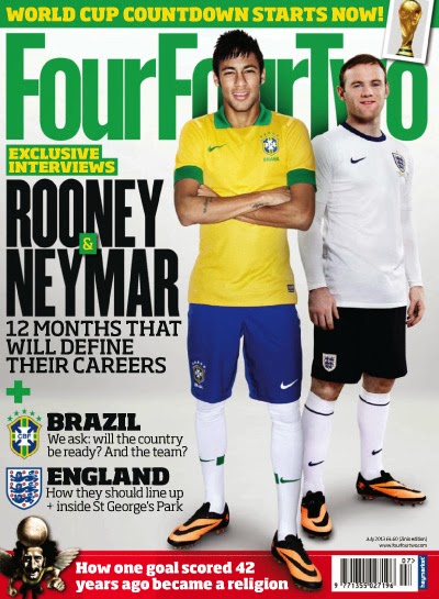
'FourFourTwo' is a football magazine aimed at the older audience. Potential viewers will realise this is a football magazine aimed at the older audience due to the front cover being not as busy and colourful as a magazine aimed at a younger audience such as 'Match of the day'. The layout of this particular magazine cover has been well planned as the main image of the two footballers has left space on the left side of the cover for the cover lines. The main image is a bold image of two footballers in a casual pose, however the footballer on the left who is in a Brazilian football shirt has been brought forward in the picture to be made the main footballer on the cover. This image has been put on the front cover to attract football fans, and this is why the main image takes up a majority of the front cover, so that potential buyers can see it from a distance. The masthead has been layered under the main image, which suggests to people that the magazine is well known, as the whole of the masthead does not have to be shown for people to recognise which magazine it is. The colour of the masthead is a bright green which links to one of the footballers featuring in the main image as he is wearing a Brazilian football shirt, which has Green armbands and a green collar. The Main cover line of the front cover is the second largest text size on the page as it is informing you of who the two footballers are in the main image. The font of the main cover line is thick and bold, so that it attracts readers and people can view it from a distance, although it is also a formal font suggesting that this magazine is for the older audience. The cover lines are all in matching font but are in different thicknesses or sizes, however they all stand out as the background of the magazine cover is plain white, again suggesting the magazine is for the older audience due to the lack of colour. The header of the front cover which is above the masthead is informing you why the two footballers in the main image are featured. The header is also in yellow text and is on a green background, again linking to the shirt of the footballer in the main image.
Wednesday, 9 October 2013
Coursework analysis of Match Of The Day

Match of The Day is a football magazine which targets the younger audience. Potential viewers will recognise that this is a magazine targeted for the younger audience due to the bright colours of the front cover and business of the page. The Masthead uses rebus, which is a type of graphological substitution as the 'o' in 'of' has been replaced by a football which links to the theme of the magazine. The masthead is in a large and think font, designed to attract the target audience. The masthead is in white font and has been placed on a red background, designed to make the masthead stand out more, however the red background of the masthead could be a possible connotation of the passion and love that young readers of the magazine have for football. The main image has been placed over the masthead suggesting the magazine is well known as the whole of the masthead does not have to be show for people to know what magazine it is. The main image has taken up a large proportion of the cover as it is aimed at attracting football fans, which is the theme of the magazine. The main cover line is in bright colours designed to attract the magazines target audience which is young football fans, potentially aged 7-13. The main cover has a variety of cover lines, which are aimed at the younger audience. All of the cover lines are attractive due to the vibrant colours of the font and the pictures which would attract the target audience. The cover line and the main cover line are in an effective font as the text has ridges around the letters making the text stand out for the audience. The cover lines also use drop-shadow on a bright background making the text easy to view from a distance. The cover lines are on a bold backgrounds designed to attract younger audiences by using bright and attractive colours, one of which is a free gift of a pack of collect able cards. The gift is there to persuade younger buyers into getting the magazine and therefore getting the pack of cards, some may even buy the magazine for the free gift. The aspect of getting a free pack of 'Match Attax' has almost become the theme of this magazine as there is even a header above the masthead advertising the fact that this edition of the magazine has a free pack of collect able cards.
Monday, 7 October 2013
Analysis of a female orientated magazine
Female Orientated Magazine

A female orientated magazine such as the one above is designed to be specifically for the female audience. Potential viewers will realise that this is a female's magazine without reading any of the text due to the feminine colours used on the front cover. The colours on the main image match the colours of the background and text, which means there is a colour scheme for this edition of the magazine. The main image is of a young actress, which means the younger audience can relate to the main image and will want to read and discover what the actress has said within the magazine. The main image is showing the actress in a attractive pose, which has been used to make the readers want try and be like the actress as she is nicely dressed and is a role model for young girls aspiring to be like her. The main cover line states 'Flatten Your Belly', this text has been purposely typed in a thin and attractive font to suggest that women should follow what the magazine says and achieve a flat belly. The majority of the cover lines are very plain as the main image is the item that attracts the reader, the cover lines simply inform the reader of what is in the magazine after they have viewed the main image. Although, the cover lines that are most likely to attract readers are typed in a bold font as these are the most interesting cover lines for potential readers to read. One of the cover lines that says 'Your orgasm guaranteed', has been typed in white font, however it has been placed on a pink slanted box, made almost to look like the smudge of lipstick; This links back to the theme of the magazine and the young actress featured in the main image.

A female orientated magazine such as the one above is designed to be specifically for the female audience. Potential viewers will realise that this is a female's magazine without reading any of the text due to the feminine colours used on the front cover. The colours on the main image match the colours of the background and text, which means there is a colour scheme for this edition of the magazine. The main image is of a young actress, which means the younger audience can relate to the main image and will want to read and discover what the actress has said within the magazine. The main image is showing the actress in a attractive pose, which has been used to make the readers want try and be like the actress as she is nicely dressed and is a role model for young girls aspiring to be like her. The main cover line states 'Flatten Your Belly', this text has been purposely typed in a thin and attractive font to suggest that women should follow what the magazine says and achieve a flat belly. The majority of the cover lines are very plain as the main image is the item that attracts the reader, the cover lines simply inform the reader of what is in the magazine after they have viewed the main image. Although, the cover lines that are most likely to attract readers are typed in a bold font as these are the most interesting cover lines for potential readers to read. One of the cover lines that says 'Your orgasm guaranteed', has been typed in white font, however it has been placed on a pink slanted box, made almost to look like the smudge of lipstick; This links back to the theme of the magazine and the young actress featured in the main image.
Friday, 4 October 2013
Male orientated magazine cover analysis
Male orientated magazine
 A male orientated magazine such as the one above, is designed to entertain the male audience. Potential viewers can tell that the magazine above is for a male audience, as the woman in the main image is showing a lot of cleavage and is in a sexual pose. The producer of this magazine has used this image to specifically attract the male audience, as the males will be sexually attracted to this image. The image is also layered on top of the Masthead, which suggests that the magazine is well known and therefore, the full masthead does not need to be shown.
The Masthead of the magazine is in red, this could represent sex, which is an aspect of why males buy the magazine as they are attracted to this sexual content. The Font of the magazine also has an aggressive tone, due to the shadowing and tone of the colour which links back to the sex appeal that is intended for the male audience. The cover lines otherwise known as the puffs of the magazine are in a bold font, designed to stand out to the reader, however the font on the main image which is providing the reader with the girl's name in the image, is thin and doesn't stand out as much, which suggests that it is the main image which is designed to attract the readers.

The Masthead of the magazine is in red, this could represent sex, which is an aspect of why males buy the magazine as they are attracted to this sexual content. The Font of the magazine also has an aggressive tone, due to the shadowing and tone of the colour which links back to the sex appeal that is intended for the male audience. The cover lines otherwise known as the puffs of the magazine are in a bold font, designed to stand out to the reader, however the font on the main image which is providing the reader with the girl's name in the image, is thin and doesn't stand out as much, which suggests that it is the main image which is designed to attract the readers.
Tuesday, 1 October 2013
Still Game - Visual, Technical and Audio codes
Still Game

Visual Codes
As the show is based on a group of pensioners, the characters are shown in a stereotypical way. The majority of the characters walk with a slouched posture which represents their age, the characters also dress in old fashioned clothes, and this is important as the pensioners are played by younger actors, so the clothes help the viewer identify who the pensioners are. The movement of the characters is very slow, and sometimes they even hold their back, the purpose of this is to give the viewer the impression that they are pensioners. The dark lighting in places such as the local pub, represent the ageing of the characters as they spend a lot of their time in the same scenery.
Technical Codes
When characters speak individually, the camera zooms in on the speaker, the purpose of this is to allow the viewer to see the speaker's facial expression. Whilst a group have a discussion, the camera moves to a long shot position, the purpose of this movement is to enable the viewer to see the entire groups body language whilst having a conversation. The slow pace of the cameras movement represents the age and slowness of the characters when moving, yet again carrying on the re occurrence that the viewer is being supplied with the idea that these characters are pensioners.
Audio Codes
The programme mainly consists of non-digetic sound, although there are occasional digetic sounds that add humour, making the show more enjoyable for the viewer. During scene changes there is often a voice over of one of the characters speaking, which makes the scene change more entertaining for the viewer as the scene change does not go directly to the scene instead it shows surroundings of the town for a few seconds. There is only music when a character puts some music on themselves so this means there is only non-digetic music, as no music is put in after the programme was filmed.
The programme mainly consists of non-digetic sound, although there are occasional digetic sounds that add humour, making the show more enjoyable for the viewer. During scene changes there is often a voice over of one of the characters speaking, which makes the scene change more entertaining for the viewer as the scene change does not go directly to the scene instead it shows surroundings of the town for a few seconds. There is only music when a character puts some music on themselves so this means there is only non-digetic music, as no music is put in after the programme was filmed.
Subscribe to:
Posts (Atom)